Trevor Maxwell

Translating Data To Insightful Stories
View My LinkedIn Profile
The advancement of AI piqued my interest. What started as an exploration of the emerging technology
turned into a career transition. I am excited to be working as a technical business analyst. I am
looking forward to what I will continue to learn and discover.

Discovering Cause and Correlation
Background
Whether you’re looking to expand your knowledge or are already an industry expert, I have collected some intriguing information for you. Let me know if you can find the nuggets.
As part of the DAA Analytics course, I was presented with this project to analyze a large dataset on the flotation extraction method for Iron ore using Python.
Allow me to elaborate further. The process involves drilling minerals from the earth to extract iron. To achieve this, the minerals are transported to a plant where water and a few reagents are introduced to separate the iron from other impurities. You may refer to a dictionary for the data if you want more context.
Insights
- Amina Flow and the Ore Pulp Density have a high correlation
- Having the right combination of pulp density and reagent plays a role in % iron concentrate produced.
- The month of August had some low points
- Overall the PH has been kept consistent
Analysis
To perform the analysis, I utilized Python libraries including Pandas, Seaborn, and Matplotlib. We uploaded the data by executing the command df = pd.read_csv and then quickly examined the dataset using df.head().
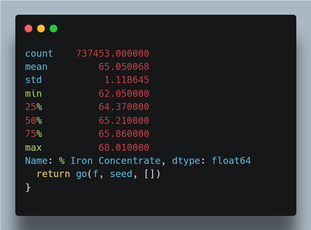
To check the amount of data we have, we can use the command df.shape, which displays 737’453 rows and 24 columns. By using df.describe(), we can see that the minimum percentage of Iron Concentrate is 62, while the maximum % Iron concentrate was 68. Since Iron concentrate is the goal I decided to look there.
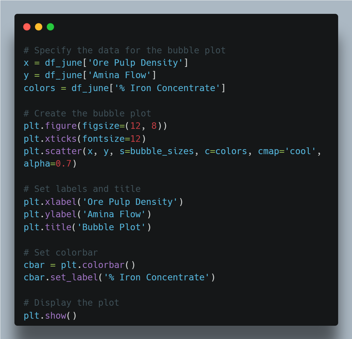
When I executed the command df_june.corr(), I observed that there was a strong correlation (0.818) between Amina Flow and Ore Pulp Density. This prompted me to investigate further by creating a bubble plot. In addition, I also included the percent Iron Concentrate in the plot, as it is a crucial factor in the overall operation.
Here is the code used to produce the bubble plot
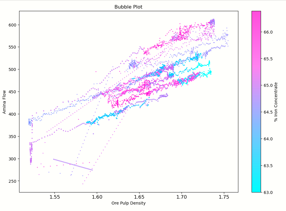
You can observe from the bubble plot how the Iron percentage is affected by the density and Amina reagent.
Let’s now zoom out and examine the month of August. By using a line plot, we can identify the times when the Iron percentage is at its lowest.
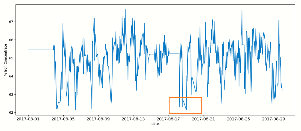 You can see in the middle of August there were a few low points. let’s have a closer look at what might be a cause of this.
Analyzing the data with a heatmap, the matrix is showing a correlation that is higher than 0.6 this is specifically looking at the 4 low days in the middle of August.
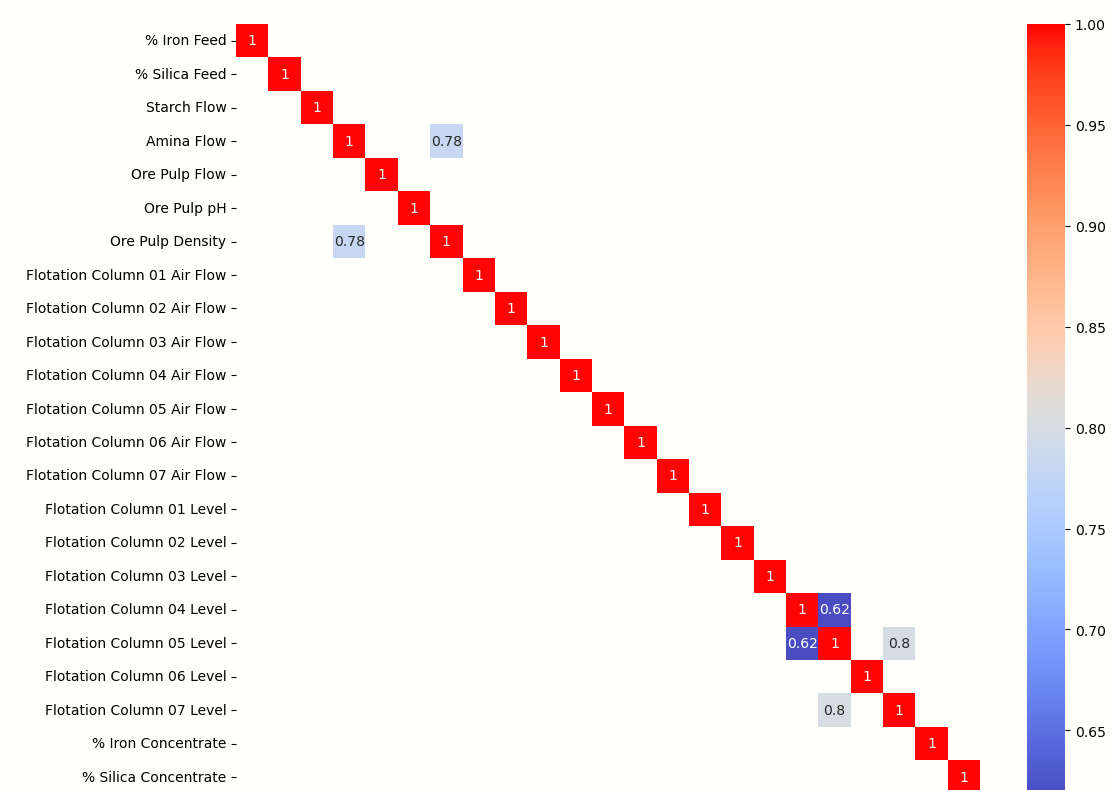
I could not find any connection between the low iron percentage and the other steps in the extraction process. This means that there is no correlation. It may be helpful to use a form of regression analysis to identify any nonlinear relationships in the data.
Before wrapping up, I decided to take a quick look at the overview of the pH levels. Upon examining the histogram, it appears that the pH levels have been fairly consistent.
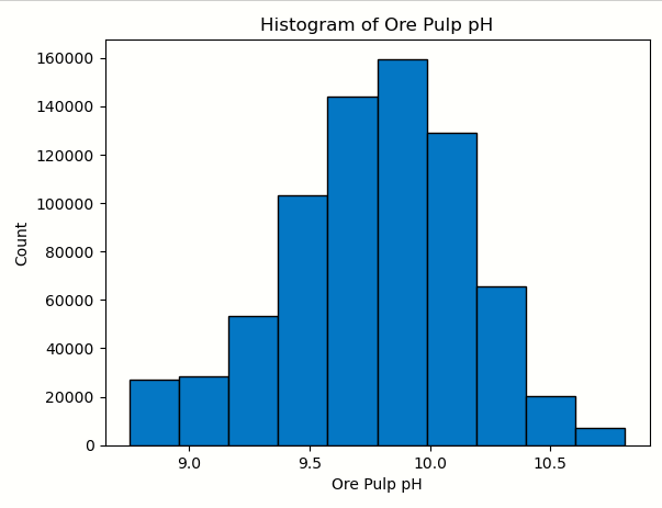
When reading about the flotation process, I discovered that regulating the pH value of the Ore Pulp slurry is crucial for controlling the process. However, I was unable to connect this to the decrease in iron concentration produced in mid-August.
Insights
- Amina Flow and the Ore Pulp Density have a high correlation
- Having the right combination of pulp density and reagent plays a role in % iron concentrate produced.
- The month of August had some low points
- Overall the PH has been kept consistent
Thank you so much for taking the time to read through my analysis.
If you made it this far and learned something new check out my LinkedIn there are even more projects there.