Trevor Maxwell

Translating Data To Insightful Stories
View My LinkedIn Profile
The advancement of AI piqued my interest. What started as an exploration of the emerging technology
turned into a career transition. I am excited to be working as a technical business analyst. I am
looking forward to what I will continue to learn and discover.
Scored Some Exciting Insights
Calling NBA enthusiasts 📞
If you love to watch the NBA or you coach aspiring NBA players. Then you are in the right place! This dataset is rich with information for you to take your knowledge to the next level.
I am no expert in regard to the NBA. However, I do like to challenge myself and learn new things. This project provided both.
The origin of the data can be found here
Introduction
The challenge for this project was to put together a data story. I felt Tableau was the best program for creating beautiful visuals and adding notes to organize a story.
I will walk you through the data story. I discover the insights as I was analyzing the data. You are welcome to visit the full interactive data story anytime on Tableau public.
There is also a bird eye view with the dashboard that I put together. If you wish to continue exploring. Then feel free to check that out.
.png?raw=true)
Key Insights
- Teamwork leads to more points. There is a strong relationship between assists and points. The more players pass to assist the more they also score.
- Each team has 2-3 superstars that are scoring the most points.
- Age 25-30 is most common and at the top of their game. The much younger players are scoring half as much.
- Point guards are getting the most assists in general. Except for Nikola, he is on a whole other level.
- The power forward seems to be very good at the 3pt shots. The center position is the worst at the 3pt shot.
The Data Story
Welcome the 2022 NBA season with 605 players. There were 304’877 total points scored. With a landscape of 31 teams.
Slide 1
Showing the relation between assists and points.
For the Bubble plot, We have the size showing the number of rebounds. color is the position. Y axis is the number of assists, X is the total points scored.
- Blue Centre
- Orange Power Forward
- Green Point Guard
- Brown Small Forward
- Red Small Guard
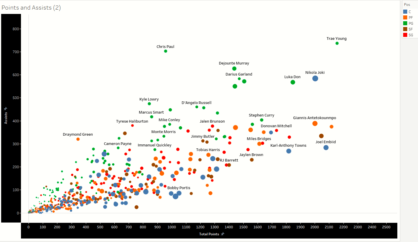
Point Guards are trending at the top getting the most assists.
Slide 2
Remember rebounds are the size of the bubble. The center position is getting the most rebounds. Nikola and Draymond are clear outliers.
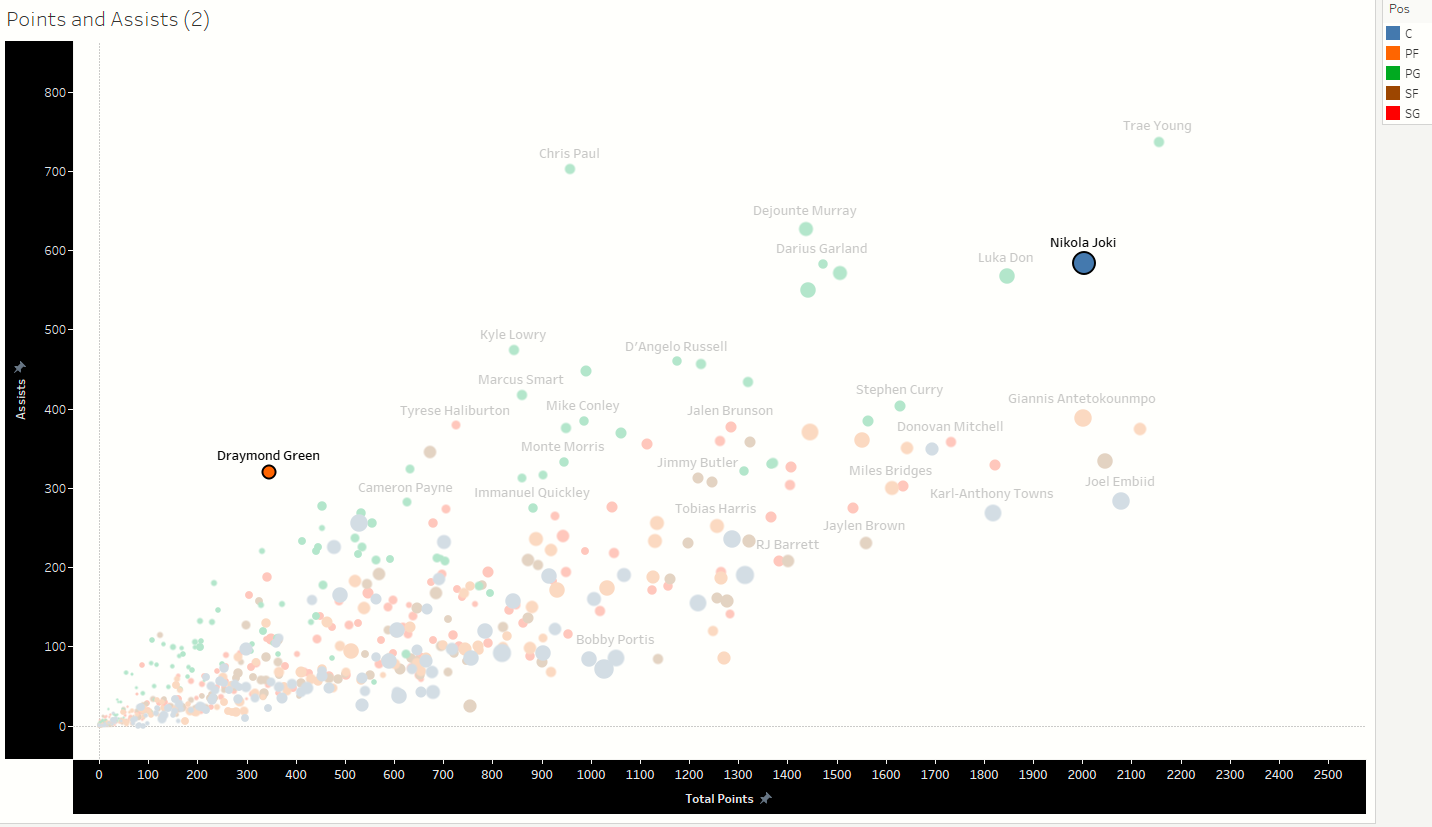
By looking more into what the outliers do we can learn things that other players can use to be more diversified.
Slide 3
This stacked bar chart is showing the teams and the top-scoring players. It is interesting to see how many superstars per team.
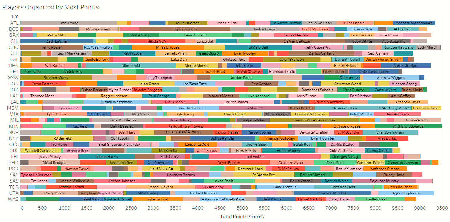
Most teams have 2-3 players scoring the majority of the points. This is reasonable, the more talented player should take the shots in order to win.
Slide 4
The treemap graph shows the relation between assists and position. It’s great to see all positions with assists showing good teamwork.
Blue Centre
- Orange Power Forward
- Green Point Guard
- Brown Small Forward
- Red Small Guard
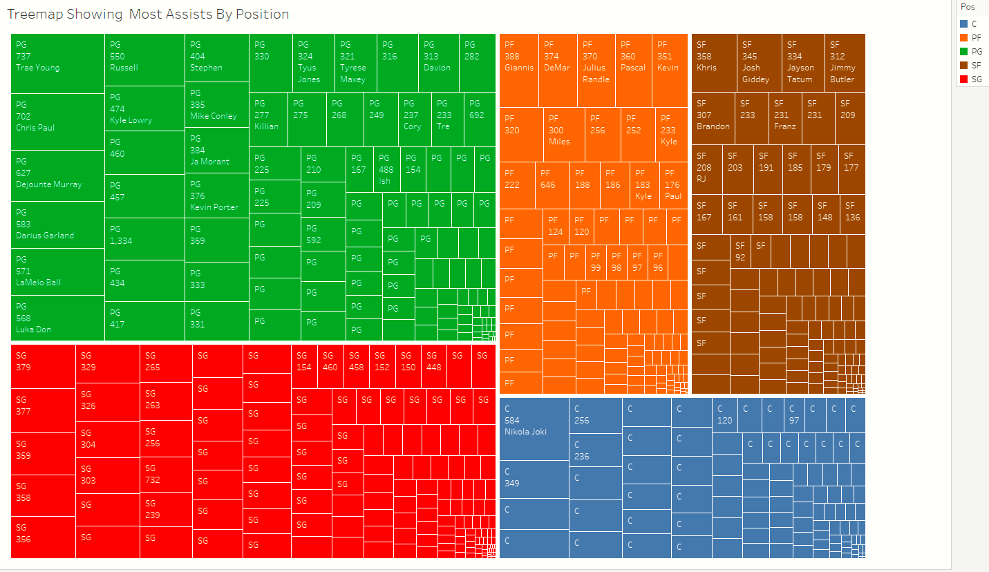
What blows my mind is the number of assists that Nikola has as a center position. It’s clear the point guard is the best position for assists.
Slide 5
Having a look at the best players that were traded mid-season. The small guard seems to have done well.
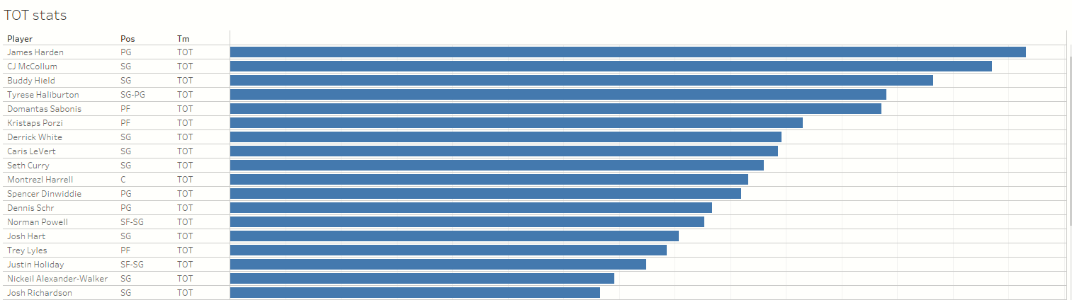
Slide 6
Even with a mid-season trade and playing a new position. These players performed extremely well.
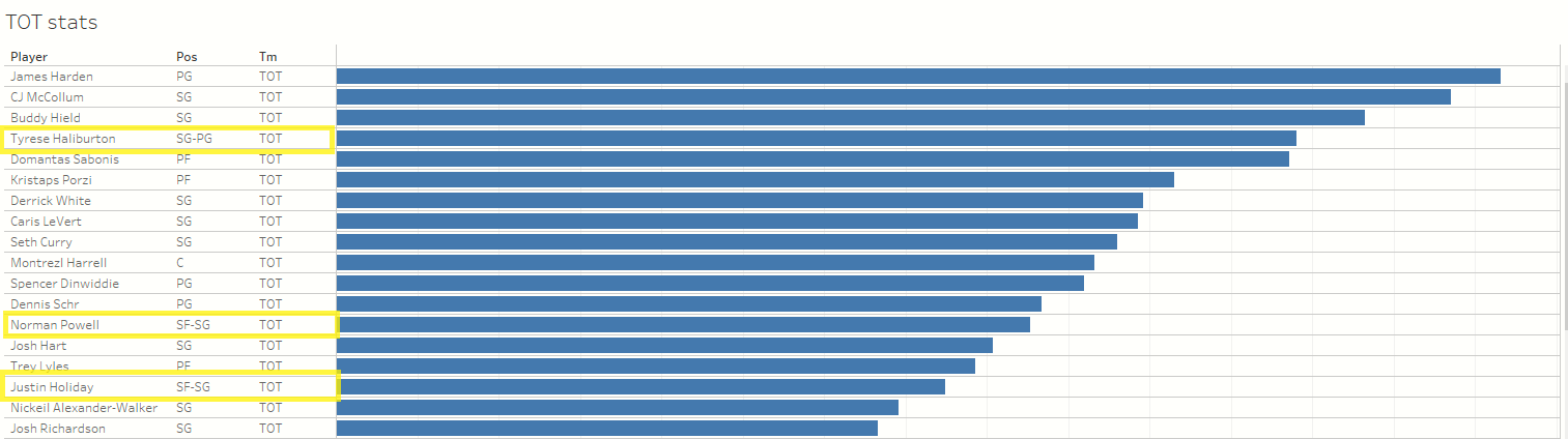
The players highlighted are: Tyrese Haliburton, Norman Powell and Justin Holiday.
Slide 7
What position has the best chance of making 3pt shots? The graph was great because a coach could use it as a template on the bench to reference.
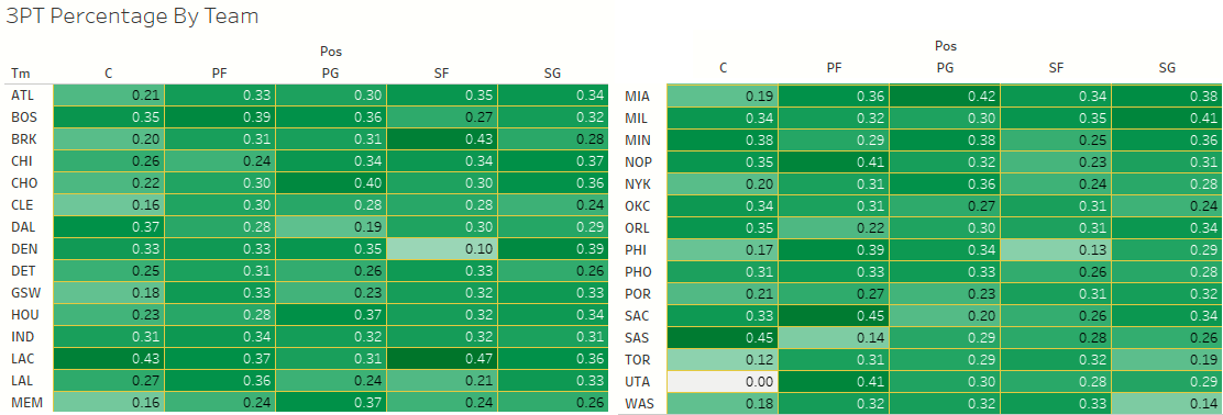
Overall it would seem power forward is the best at the 3-point shot.
Slide 8
I would think the point guard should have a better 3-point percentage. The center’s position on these two teams really stands out because they are outliers.
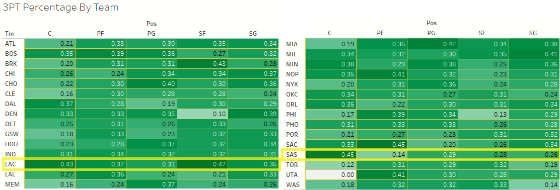
The teams with the center making a lot of 3-point shots are LAC and SAS.
Slide 9
Lastly, I had a look at how age can affect scoring. Lebron James at 37 even though he is older he still performs well. Udonis at 41 has not done much he scored almost nothing.
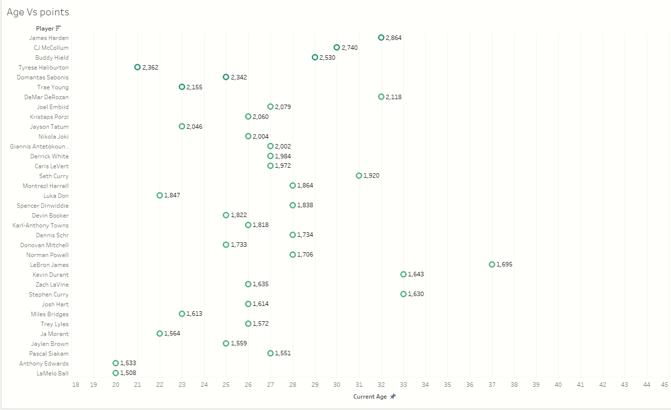
Next to each point is the total point scored for the season. The bottom X axis is the age.
Thank you so much for hanging on until the whistle and allowing me to explain my data exploration with a data store.
### Key Insights
- Teamwork leads to more points. There is a strong relationship between assists and points. The more players pass to assist the more they also score.
- Each team has 2-3 superstars that are scoring the most points.
- Age 25-30 is most common and at the top of their game. The much younger players are scoring half as much.
- Point guards are getting the most assists in general. Except for Nikola, he is on a whole other level.
- The power forward seems to be very good at the 3pt shots. The center position is the worst at the 3pt shot.
The End
If you made it this far and enjoyed the project. Please check out some of my other projects on LinkedIn. Would love to connect.
 .
.